

From Friction to Conversion
How I redesigned the subscription journey that grew subscribers & revenue by 25%.


Client
The New Yorker, Vogue, Vanity Fair, Wired, Condè Nast Traveler, Bon Appétit, Epicurious, GQ, Architectural Digest, Pitchfork
Categories
Interaction Design, UI Design, Design System, User Research & Testing, Subscription Conversions, User Retention and Engagement.
Duration
May - Dec, 2023 (8 months)
Credits
Adam Lifshitz, Marcella Maltese, Shweta Gupta, Pooja Doshi, Sammie Spector, Jack cave, Vir Karamchandani, Gabriela Resende
The pandemic (post 2020) triggered a spike in digital engagement, driving subscription growth across brands like The New Yorker, Vogue, and Wired. To sustain this momentum, Condé Nast began centralizing paywalls and checkout infrastructure.
While subscriptions were high during 2020–2022 due to lockdown, low user engagement and dropouts started emerging later.
In 2023, I was part of an ambitious project to redesign the subscription journey, focused on conversion rate optimization (CRO), user engagement, and clearly communicating the value proposition and benefits while creating a premium and compelling experience.
Collaborative workshops
Phase 1: I worked closely with data, product, marketing, and research teams to analyze the subscription flow, focusing on user expectations and marketing needs.

Card Sorting - Optimization strategy

-
Users had to manually calculate value, causing drop-offs. Bottom content blocks (~30% viewership) showed no conversion impact
-
Users couldn’t connect with the brand values and offering, would often confuse with the benefits
-
Majority of users drop from the landing page after seeing true annual cost; price framing unclear, no motivation to drive forward
-
Users expected more dynamic, premium-feeling design.
User Research - Customer journey

The New Yorker
Mobile journey: from Paywall to checkout

10 participants
→ 6 Potential Subscribers
→ 4 Recent Subscribers
1:1 in-depth interviews (75 mins)
Focus areas and benchmarking
-
![]()
Select an offer
20% of mobile users don’t see the the 2nd offer on dual offer pages
-
![]()
Make it compelling
We are noticing how our current solutions don’t provide a sense of premium experience, but are described as “standard”
-
![]()
Flow Architecture
Being asked for email details together with the card details with a “passwordless” copy confuses some people.
-
![]()
Tranparency and Reassurance
Appreciated the legal copy but didn't quite read it. Advertise the SSL encryption protocols we use
-
![]()
Streamline order summary
On desktop, on payment mode page, 34% users interact with order summary, 44% of these did not subscribe
-
![]()
Address optimisation
User preference for Smart Pay methods indicates users want automation where possible. 25% of errors caused by address related fields.
-
![]()
Delight and celebration
We want users to delight in their interaction with our checkout flow. We believe this will keep them engaged throughout.
-
![]()
Reducing users’ effort
We want to reduce effort for all users, but specifically pay by card customers present a big opportunity for optimising conversion.


My process and timeline using the MoSCoW framework
Phase 2: After defining my design priorities as per MoSCoW framework, I took a step back and re-looked at the project timeline from a holistic view, ensuring it allowed sufficient space for meaningful design discovery.


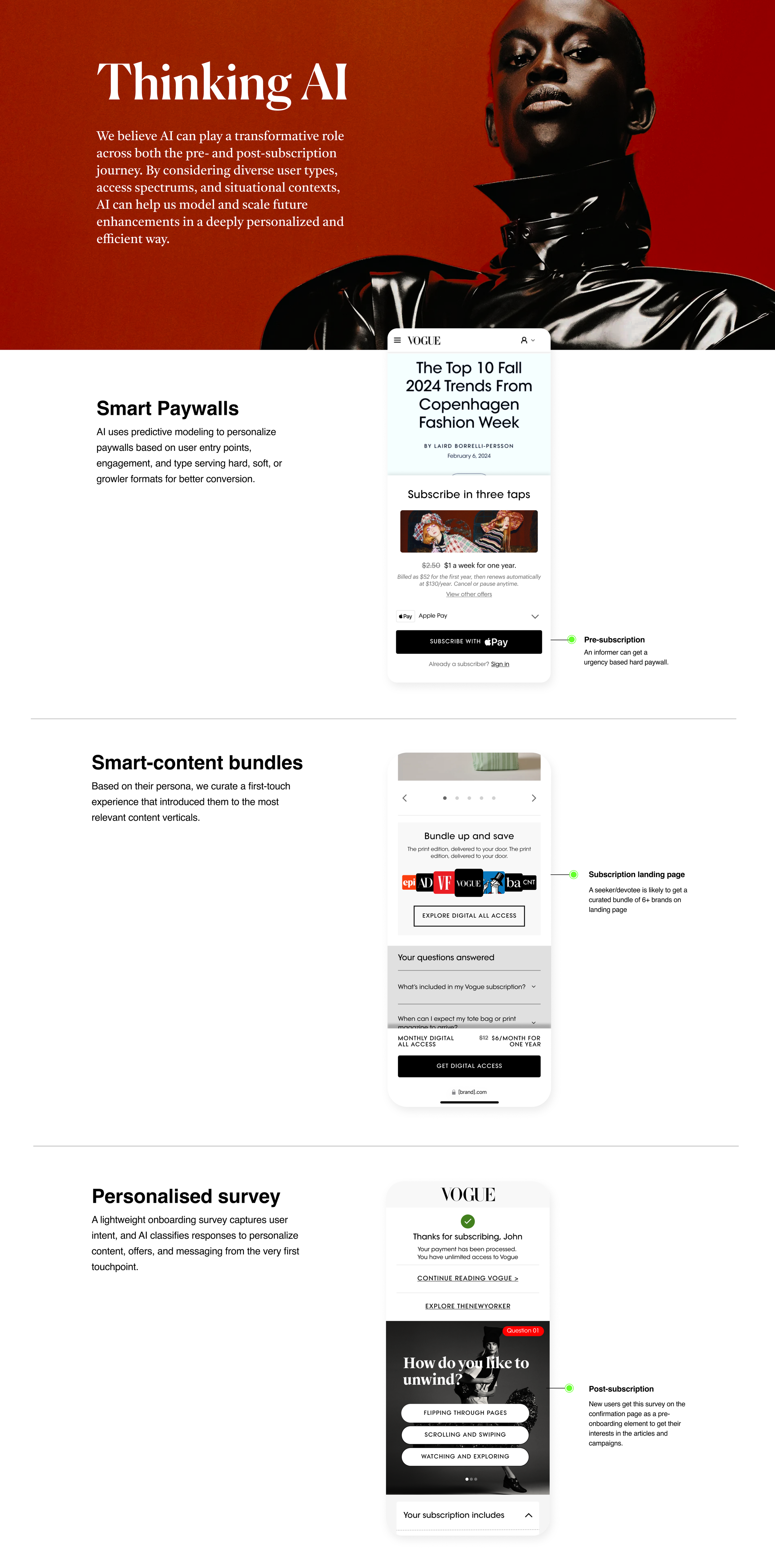
INTRODUCING •
INTRODUCING •
Landing page 2.0
How might we better promote the value, benefits and terms of our subscription products so that users feel compelled to choose an offer?
Checkout flow 2.0
How might we make purchasing a selected offer quick, friction-less, clear and compelling?
Building like Lego: Crafting modular UX system
Phase 3: Wireframes tested how modular blocks (offers, value props, media, and CTAs) could flex across layouts. Each concept explored stacking, flow, and hierarchy to ensure components worked seamlessly across brands and devices before moving to visual design.

Time to jam on my machine - let’s kick this off!
I leveraged research insights and workshop outcomes to design modular blocks using core UX principles and heuristics. These formed an adaptive framework that allowed marketing teams to easily plug in their content while keeping the experience clean, focused, and easy to navigate.
Pain Point #1
Hard to compare offers → Users drop off
• Offer block: Simplified offer comparison to reduce cognitive load.
• Streamlined content architecture to facilitate faster decision-making.
Solution: Hick’s Law
Pain Point #2
Brand experience → Lacked editorial richness

• Added subscriber life preview section with branded visuals.
• Enhanced premium perception through improved design.
Solution: Aesthetic-Usability Effect
Confusing form layouts → Higher abandonment rates
Pain Point #3

• Order forms: Grouped related form fields, reduces mental effort & improves scannability.
• Separated Billing and Shipping sections to avoid confusion and mistaken entry.
Solution: Law of Common Region
Pain Point #4
Dense tap targets → Frustration on small viewports

• Ensured finger and cursor-friendly target sizes of input fields and CTAs for seamless interaction across mobile and tablet.
Solution: Fitts's Law
Pain Point #5
Missing value proposition → Low user engagement

• Value Proposition block: Adding interactivity and response to user actions.
• Using transitions to maintain interest during navigation.
Solution: Doherty Threshold
Pain Point #6
Lack of support at decision point at landing page → User drop-off

• Making the selection CTA sticky to provide easy completion.
• Positioning FAQs strategically to address concerns while making a offer purchase decision.
Solution: Peak-End Rule

Learning Curve
Phase 5: Based on insights from usability testing, we identified key areas for improvement. I collaborated with engineers to conduct a thorough QA across all pages to catch and fix gaps, then revisited feedback to bring more inclusivity into the subscription journey. These changes, along with ongoing refinements, have helped make the checkout flow more seamless and user-friendly.
Viewport Distribution of Condé Nast Audience


While designing Subscription 2.0 for Condé Nast, I learned to balance global consistency with local brand needs. A key learning curve moment was realizing that optimizing for conversions alone doesn’t always lead to long-term subscriber satisfaction. Early in the process, we explored UI patterns that emphasized urgency and limited-time offers to drive immediate sign-ups. However, user testing revealed that some of these patterns introduced friction especially among readers who were engaging with our more thoughtful journalism. This moment taught me the importance of designing for sustainable engagement over short-term wins.
Reduced navigation ambiguity
We improved navigation clarity by introducing clear labels on top nav and optimising the checkout flow, reducing drop-offs by 18%.
These screens represent scalable, brand-agnostic templates for a redesigned subscription journey.


Visual Strategy & Design system setup

Phase 6: I led the visual strategy for Condé Nast’s subscription flow by establishing a brand-agnostic design foundation. I defined a system of color, typography, and spacing tokens that mapped to each brand’s identity, ensuring consistency without compromising their visual language.

The Conversion Effect!
Through UX efforts and strategic design interventions, we delivered meaningful business impact across multiple brands. There were significant uplifts in conversion rates, subscriber growth, and revenue.
Vogue led the results with a standout 25.2% increase in subscribers, a 24.4% uplift in revenue, and an 18.7% rise in conversion rate (CVR) .


Key Takeaways
Data-driven design
Design decisions were made out of analytics and research, thus resulting in tailored outputs of growth and subscribers
Progressive disclosure works
Simplifying interfaces by showing relevant details (e.g., address fields post-payment selection) improved usability and conversion.
Consistency across brands is critical
Leading subscription design across multiple brands taught you how to build scalable, flexible systems while respecting individual brand voices.
Revamp Over Redesign
My approach often focuses on optimizing existing flows instead of reinventing them, reducing friction while preserving familiarity.
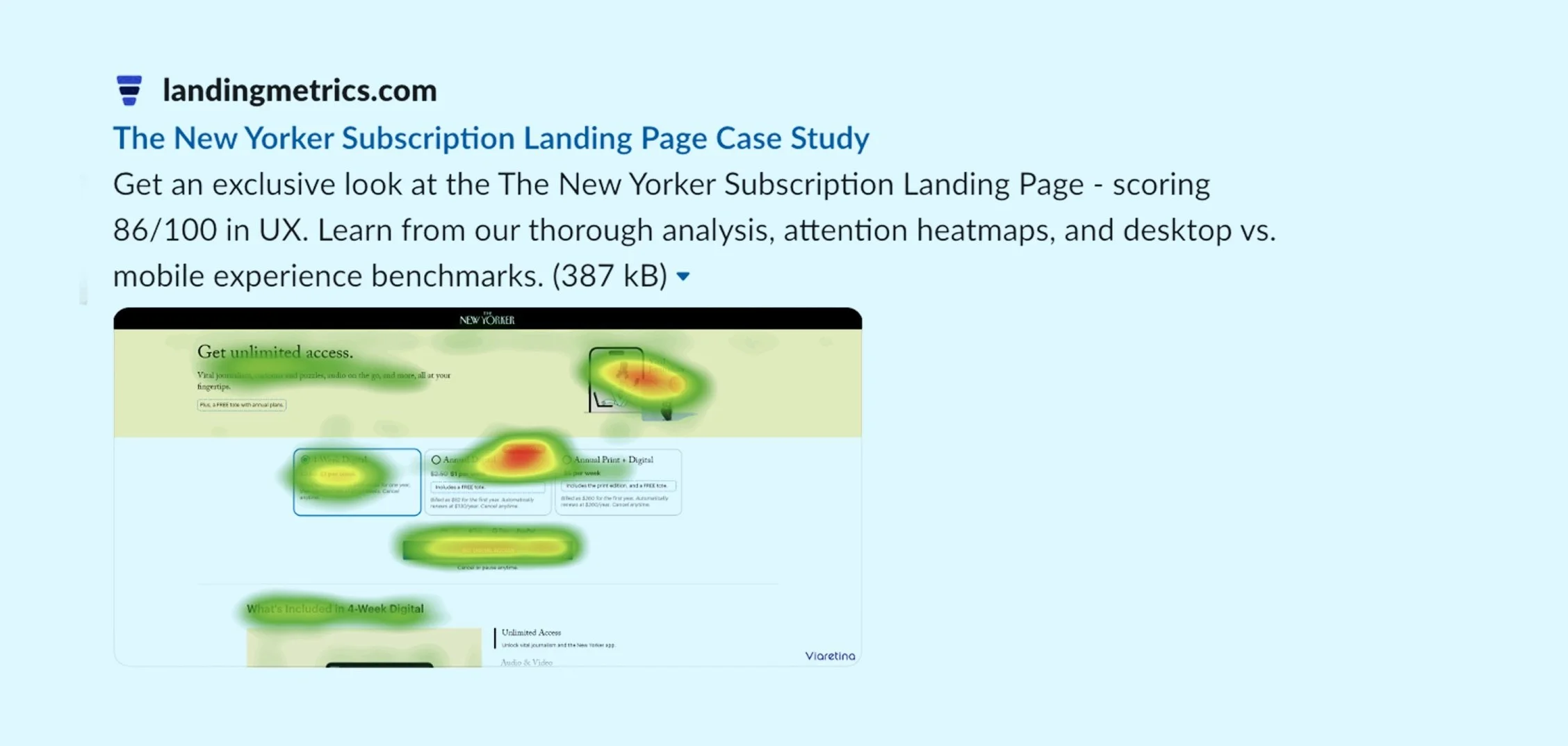
Featured: Top 5 Out of 232:
The New Yorker subscription page 2.0 shines in UX Rankings!
Curious to see the entire process of how I boosted revenue by 25%? I’d love to share the full story.